Werimart

E-Commerce Solution for streamlining business operations

What was and What is

Legacy system complexities

In the legacy system, the process of creating an item listing was inefficient, involving unnecessary steps and user flow disruptions. The complexity and lack of hierarchy in the user interface made it difficult for users to navigate and complete the task of creating listings efficiently.    

Enhanced item creation flows

By focusing on simplifying the user flow for item creation, and providing user with the flexibility to create quick or detailed listings, I ensured that users can easily create and manage items.
Who is it for?

Werimart*

The company provides integrated tools for retail management, including inventory, order processing and CRM. Their B2B platform streamlines operations to enhance business functions.
*The name of the company has been changed for confidentiality reasons
DETAILS

Role

  • UI Designer Delete
  • UX Designer

Key Responsibilities

  • User Flows
  • Interface Design
  • Component library
  • Prototyping
The Problems

Auditing the existing UX

I followed the entire flow and relevant screens for item creation in the existing platform and identified key issues that complicates the user experience of creating an item

1.

CTA Visual Heirarchy

The main CTA of the flow aka create a listing is very low in prominence and is represented by an icon button only

2.

Listings Data Grid

Unclear indicators for multiple columns, eg category and item status.

3.

Unnecessary Steps

New listing only requires to inputs, name and category, but is divided into four steps with inconsistent headings inside a modal. Additionally, the modal on top of modal further disrupts the user flow.

4.

Unclear division of listing details
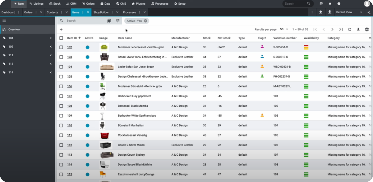
Different required and optional inputs in the modal and the view listings page.
Increasing Flexibility, reducing complexity

User Flow

I divided the process of creating an item into two flows, quick listing and detailed listing, clearly distinguishing between required input and optional to make the process more efficient

Components Library

I created reusable components for navigation, buttons, input fields, tags and others. Additionally I also used the brand colors to define the primitive tokens for the platform

What I Learned about the e-commerce domain

Flexibility enhances UX

If I look back at the process or redesigning the experience, I would say the most important aspect of the entire process was to understand what the user is trying to achieve (through analytics) and then translate that into the experience aka segregating the item creation process into quick listing and detailed listing.

Consistency reduces Complexity

While its true that consistency is important for products of all sizes, it is vital for complex products that offer a large portfolio. Ensuring the implementation of design system elements, including components and color tokens makes it easier for the user to comprehend the action results across the product.